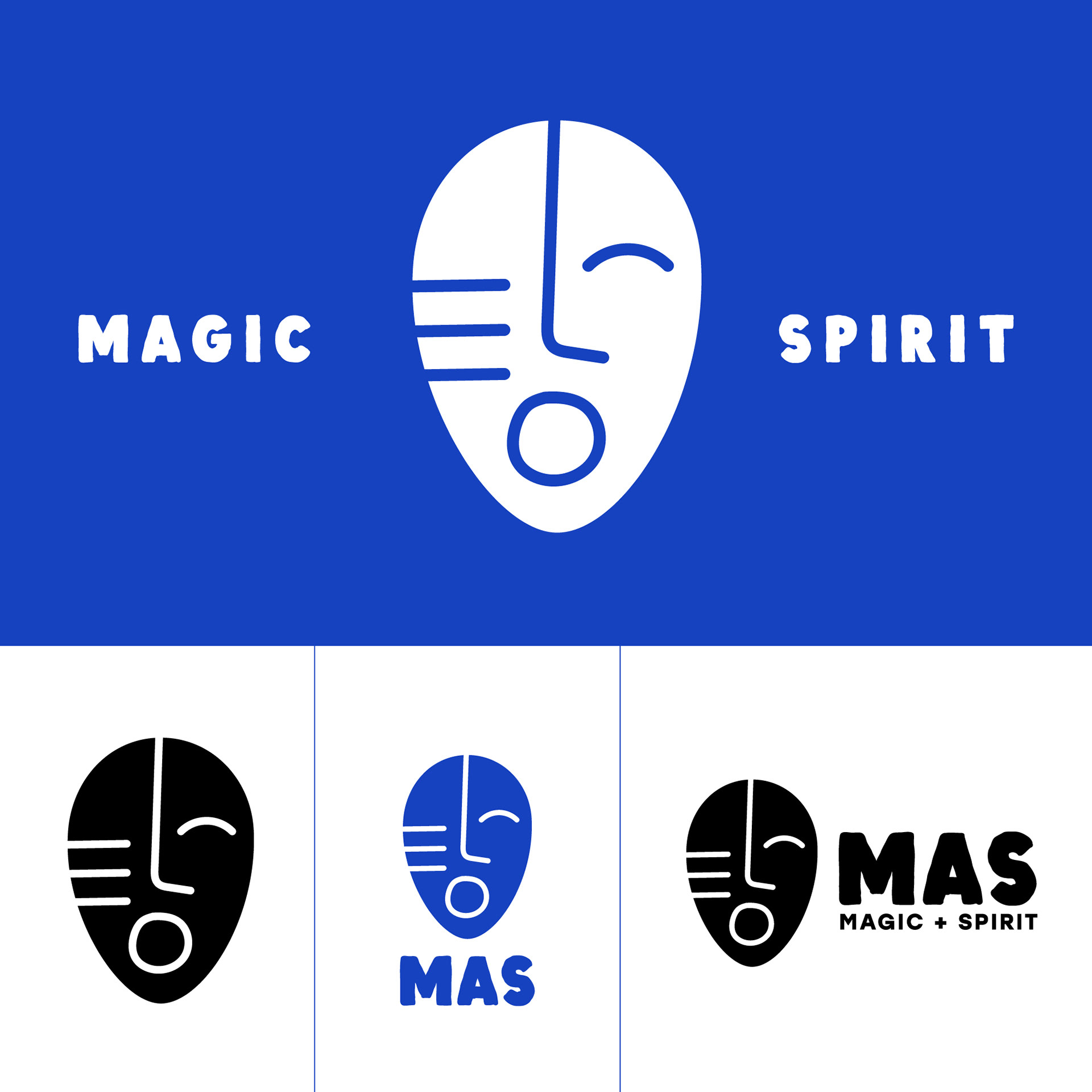
How do you brand Trinidad and Tobago Carnival? I feel it is almost an impossible task to have one thing represent all of it. When I was approached to create a logo for a Carnival related theatrical event taking place on Carnival Monday and Tuesday in the middle of the pandemic entitled MAS, I have to admit I was a bit scared. Add an impossible timeline of 3 days. I was sweating bullets! Thank goodness for concept and inspiration. I was sitting in Full Bloom Coffee Shop and quickly sketched this final logo in my book while Freetown Collective We Bad was playing. I continued designed more and more options because I felt this was too simple, it couldn't be it. Everytime I looked at it, I felt something, I could see it singing the ooooo's from Feel the Love after Muhammad sings A million people coming down, dancing to a song! My pores raised a bit, but this couldn't be it. This logo was meant to represent the various spirits of Carnival.
This logo was also had to be versatile enough that in the years to come, it can be used for more than just promoting this 2-day show. In the end, after presenting other options, this logo was the one that was chosen.
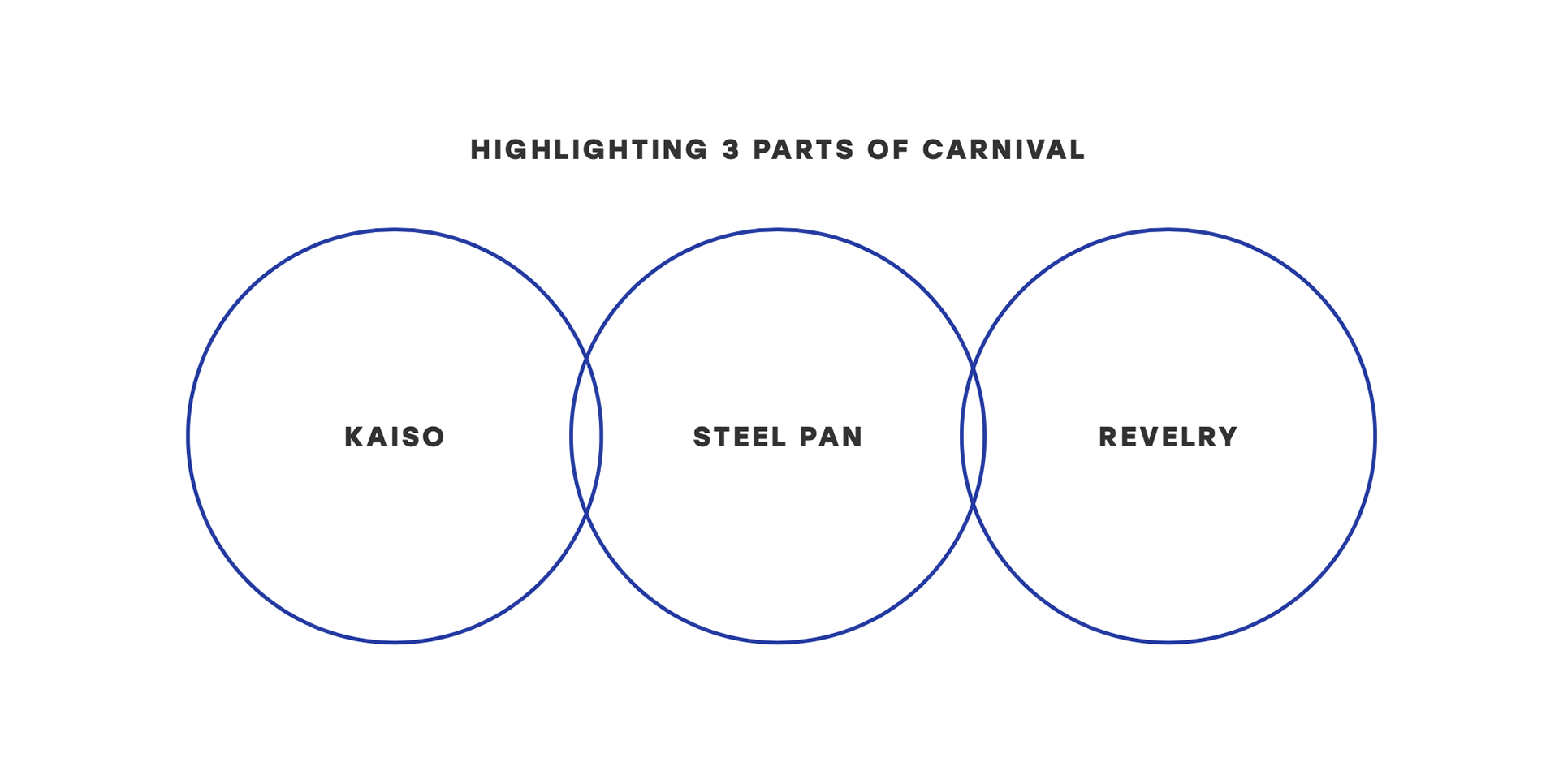
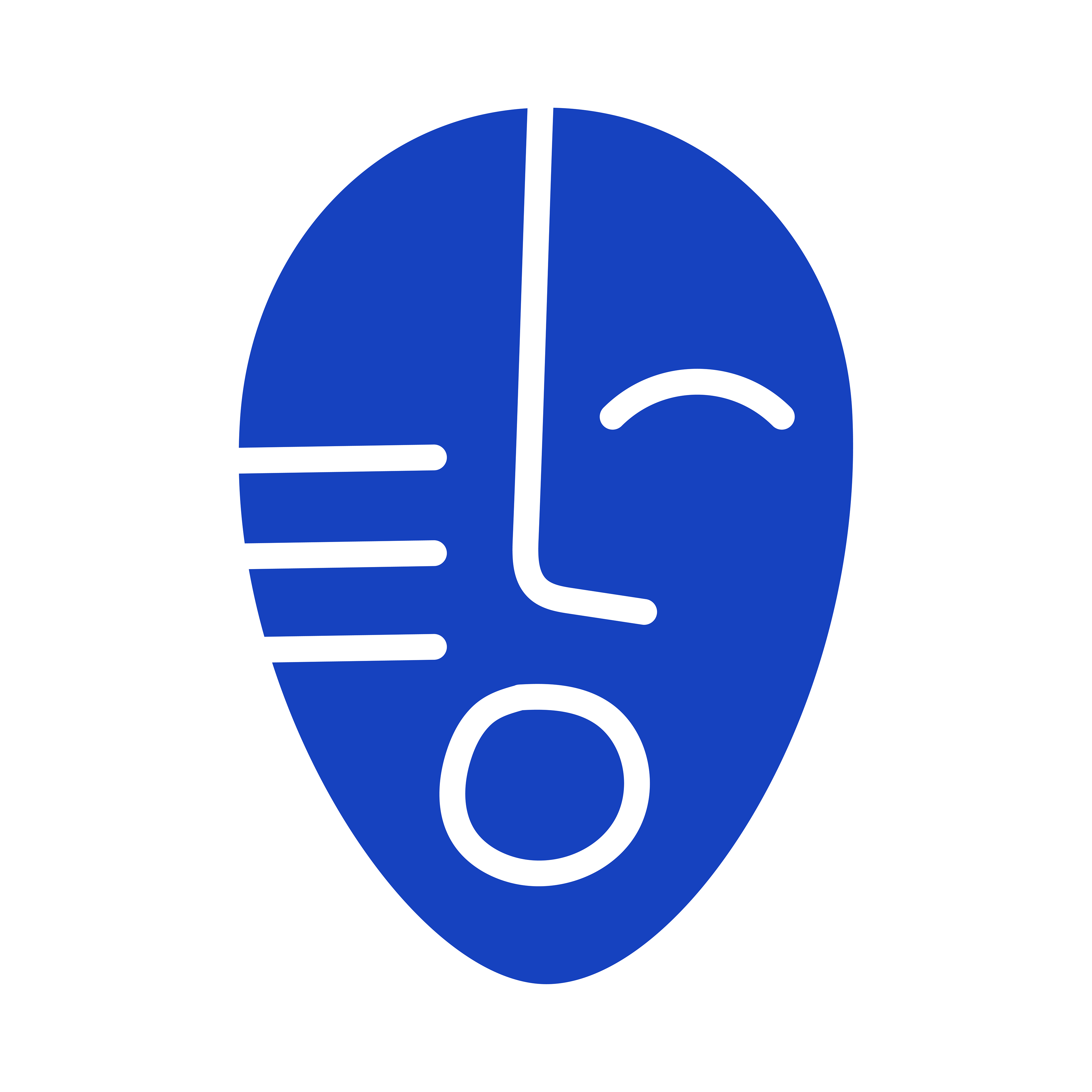
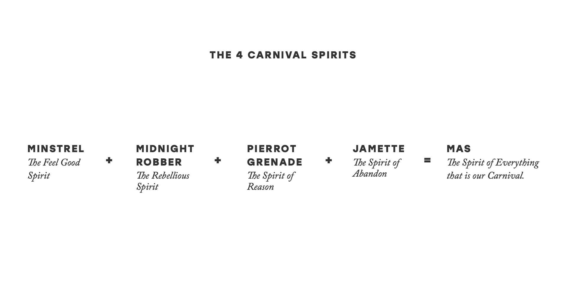
The blue was chosen based on the blue soap we use to wash off the paint after j'ouvert, the blue devils, an important aspect of the Carnival spirit, and mal-yeux or maljo, used to cut blight. The mask has 3 stripes because I was playing with the power of threes, it's one of those symbolic numbers that crosses different beliefs etc. So M, A, S: 3, Kaiso, Pan, Mas: 3, if we're getting spiritual, the Holy Trinity, if we're getting patriotic, the Trinity hills. 3 just seemed like the right number. Additionally, our carnival is heavily influenced/based on our African roots, and comes out of slavery (as can be seen in the Canboulay Riots reenactment) and we are closely connected to Yoruba tribes who use face masks and lines on their faces and thus the 3 lines on the mask.