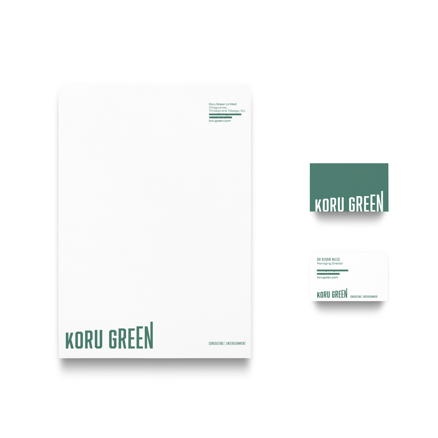
The koru is Māori for "loop or coil" and is based on the appearance of a new unfurling silver fern frond. It symbolises new life, growth, strength and peace. But that has very little to go with the design of this logo. While at first I did try to go in that direction, this logo was inspired by what Koru Green actually does: commercialise creative content. I was inspired by profit charts and the musicians who are currently Koru Green’s clients.