This job was a logo redesign. I met the client while working with NEW FIRE Festival and every year when I placed their logo in the festival guide I thought they should get a new logo. My workload at the time didn't allow me to offer my services. However, last year the client approached me to redesign the logo and I was so ecstatic! I am fan of their business and their knowledge about sustainable practices beginning with composting and waste management.
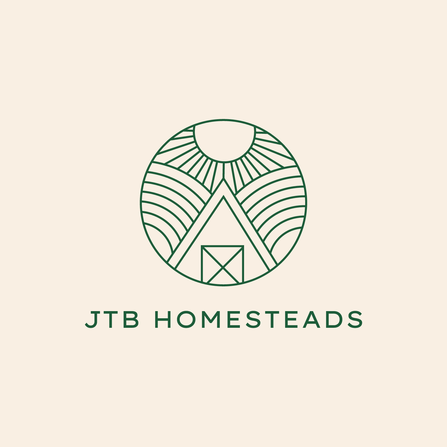
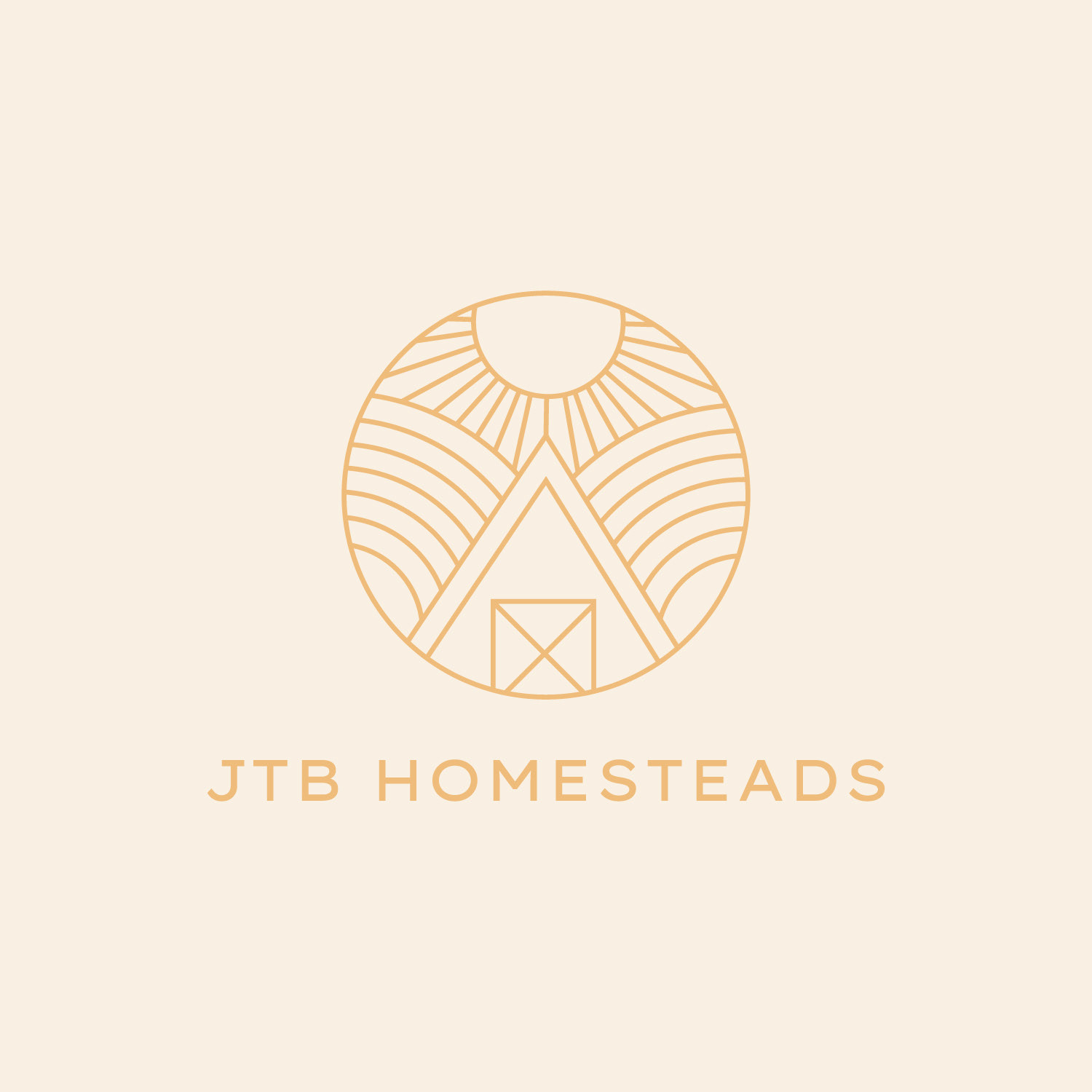
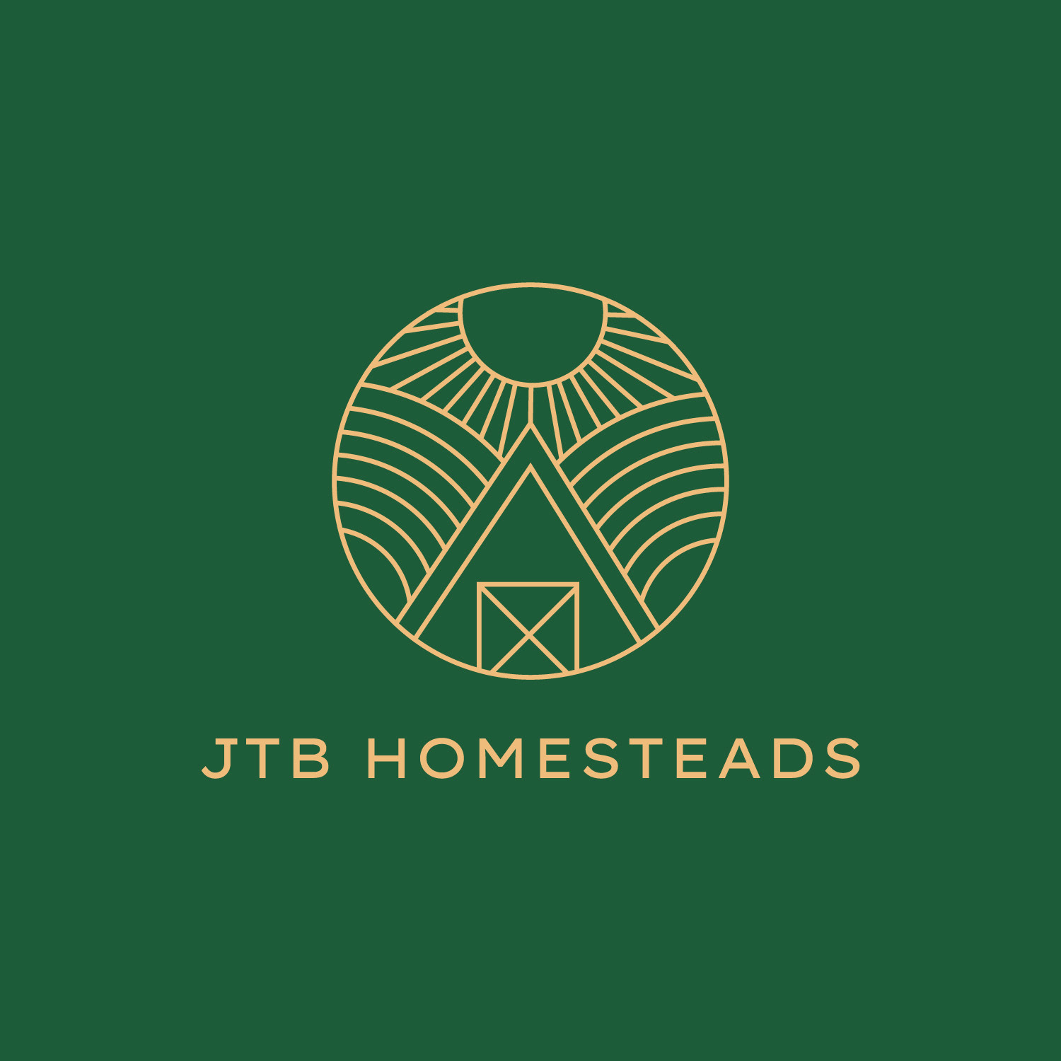
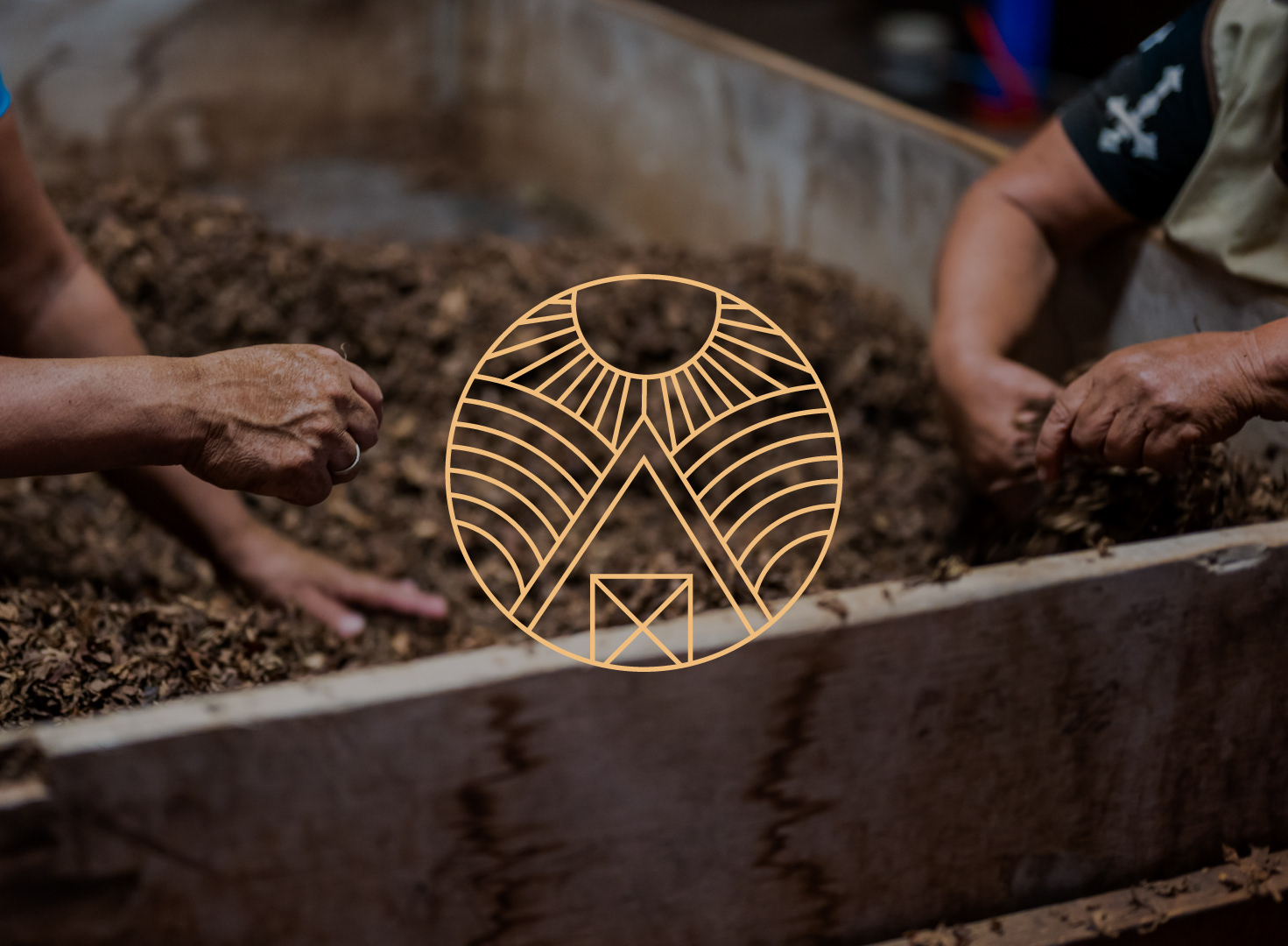
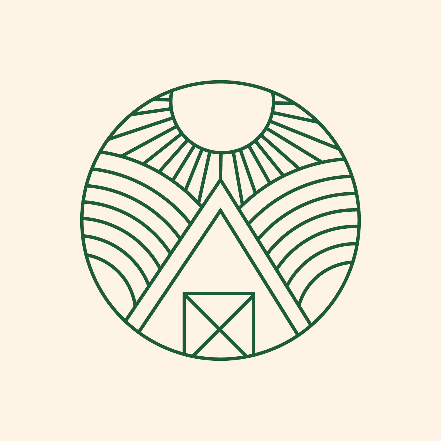
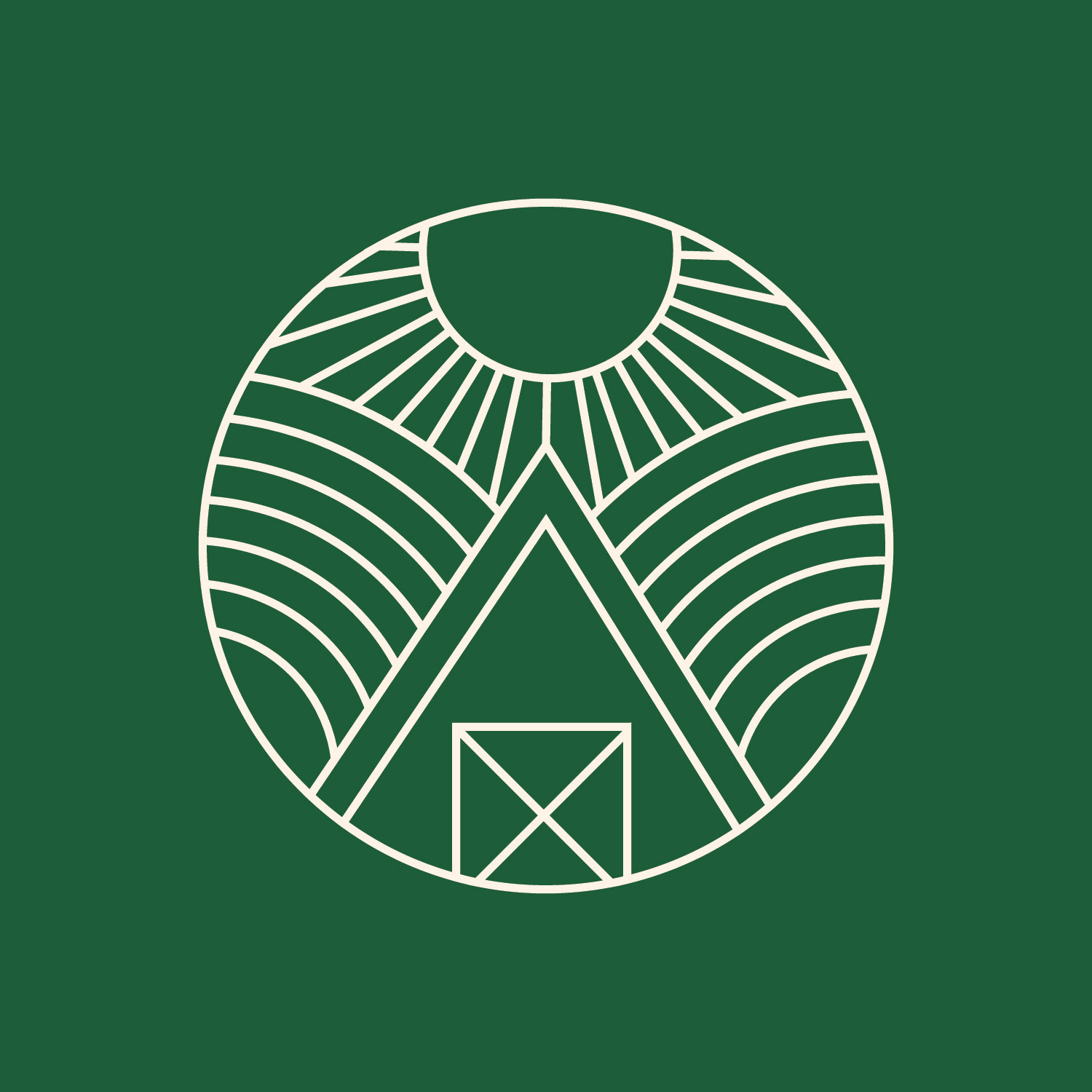
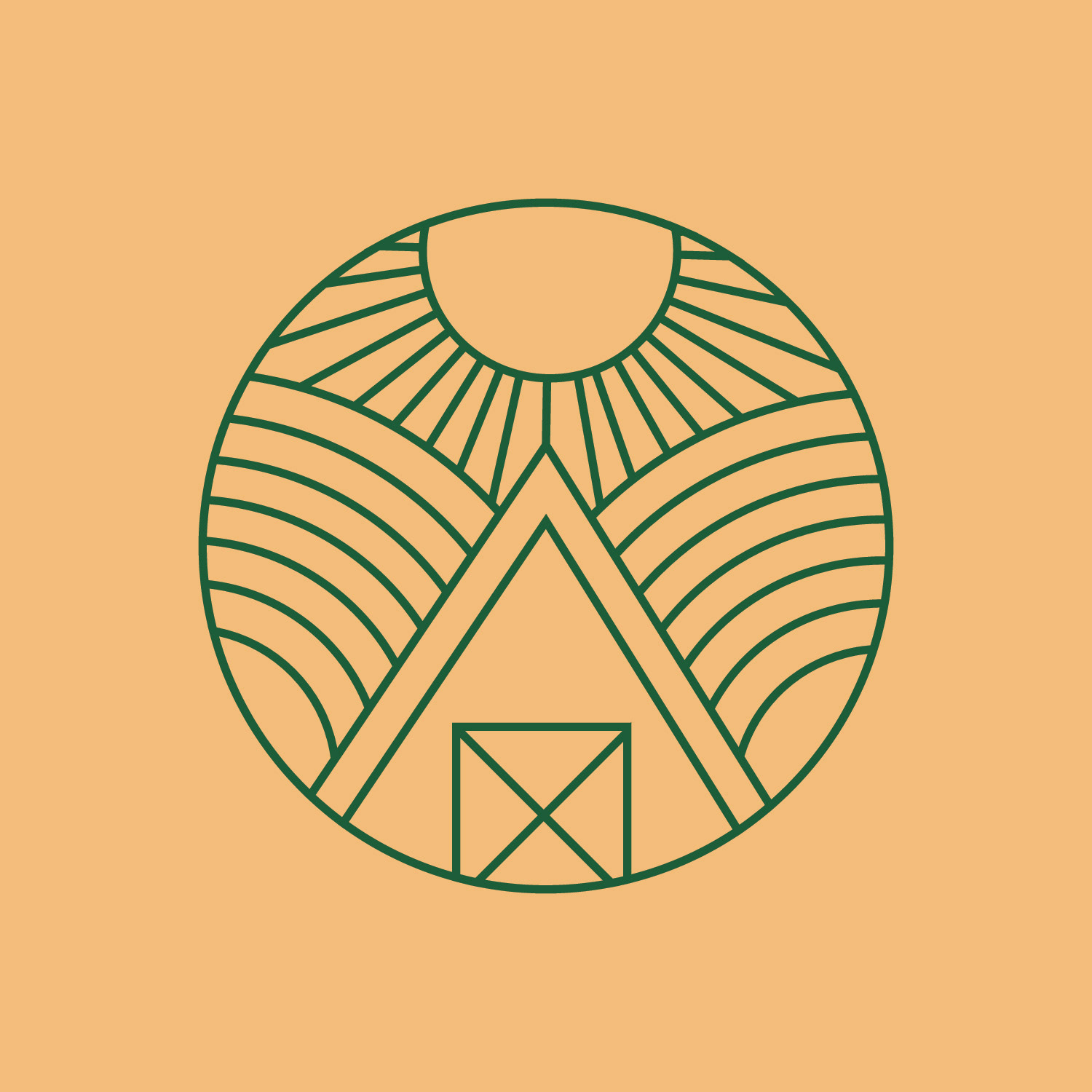
A homestead is a house and surrounding land owned by a family — often, it includes a farmhouse. JTB stands for James Theodore Bernard, the great grandfather of the client, who owned cocoa estates in North East Trinidad and was amongst a small and growing group of black entrepreneurs in the early 20th century. The client also has a background in permaculture. All these things inspired the circular seal like design I created for this logo. A circle to symbolize cycle, and nature taking its course and the 3 elements: sun, land, home that make up the homestead.
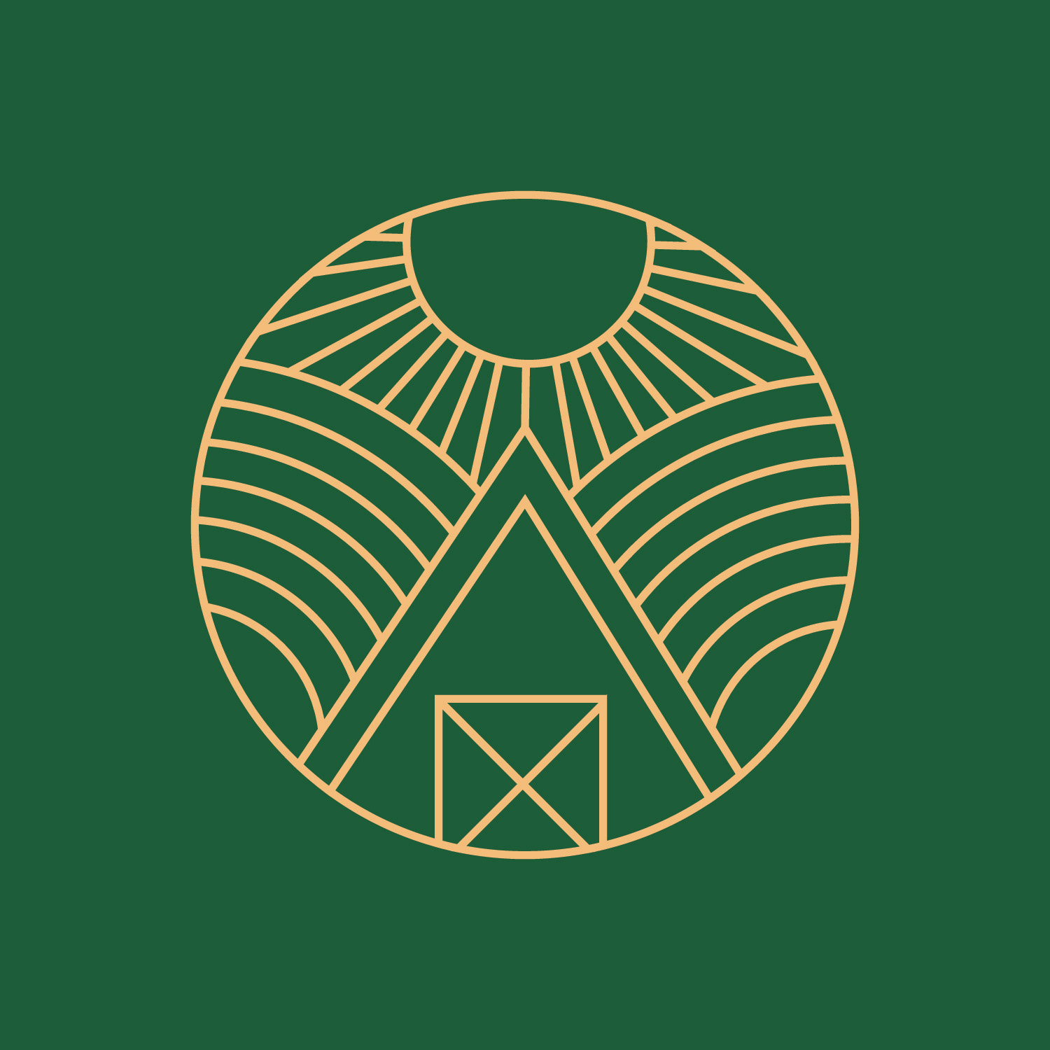
A homestead is a house and surrounding land owned by a family — often, it includes a farmhouse. JTB stands for James Theodore Bernard, the great grandfather of the client, who owned cocoa estates in North East Trinidad and was amongst a small and growing group of black entrepreneurs in the early 20th century. The client also has a background in permaculture. All these things inspired the circular seal like design I created for this logo. A circle to symbolize cycle, and nature taking its course and the 3 elements: sun, land, home that make up the homestead.
I really enjoyed working on this redesign.
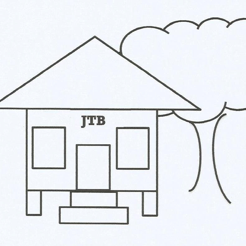
The previous logo