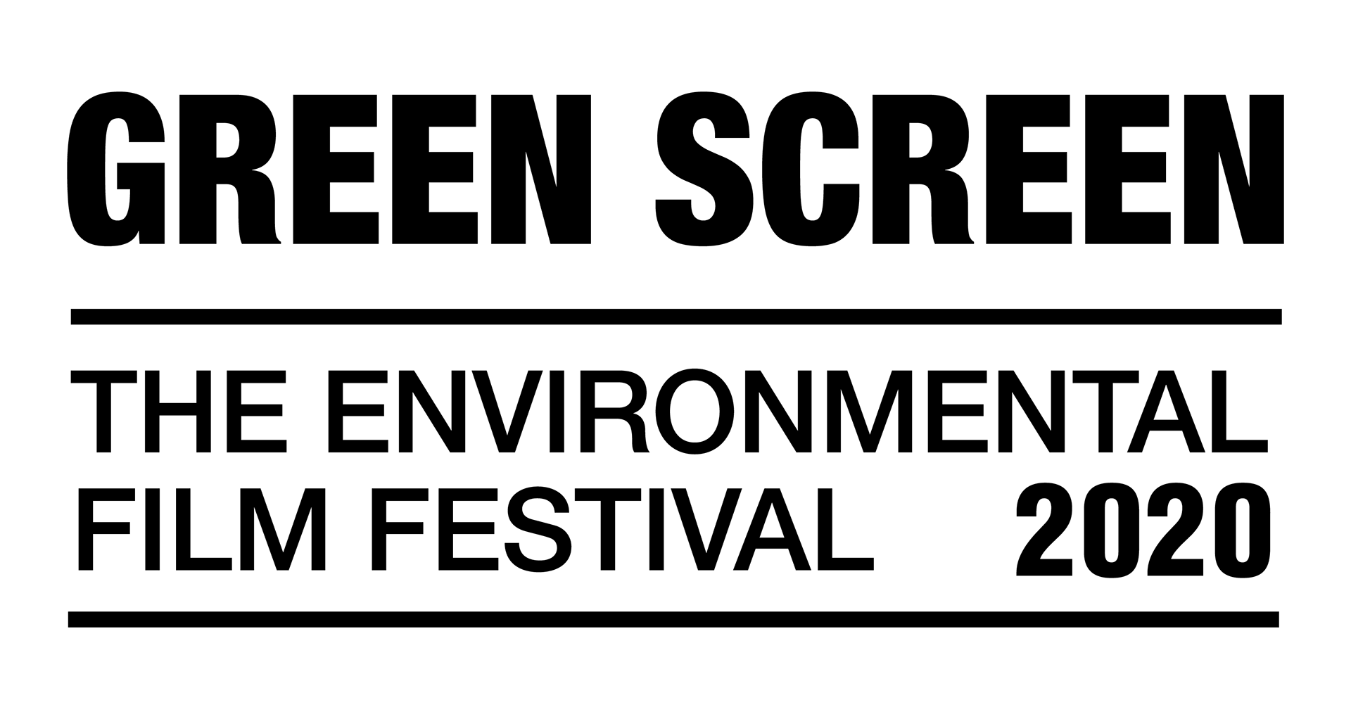
At the beginning of the year (pre-COVID) Green Screen Environmental Film Festival (Green Screen or GS for short) approached me to be a part of the team for the 2020 edition of the festival. I worked with the festival before but this was different, we were talking rebranding and shaping the festival for the future events. Excitement and nerves galore!
This re-brand is near and dear to my heart. I am from the school of thought that less in more, simple doesn't mean boring, and you can use basic elements to communicate volumes. That is where I began with this project. Film is an ever moving, ever changing thing, and the logo would have to complement that well. What shapes and fonts can be paired well with full coloured RGB moving visuals? Take a read of the full logo rationale below.
Previous Logo Design
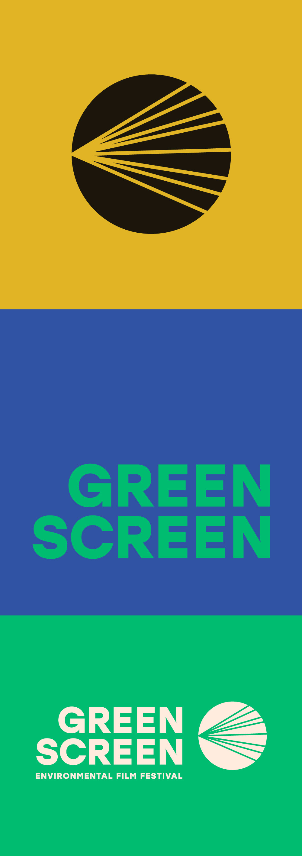
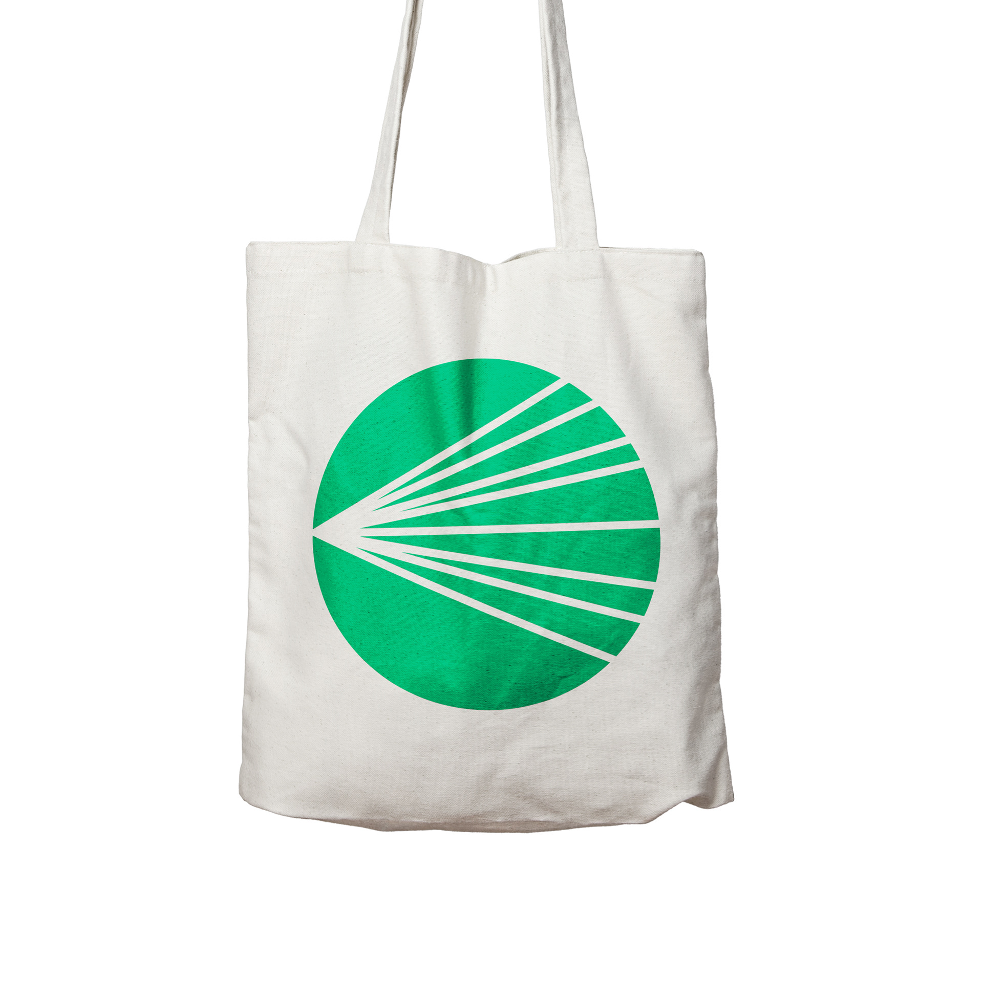
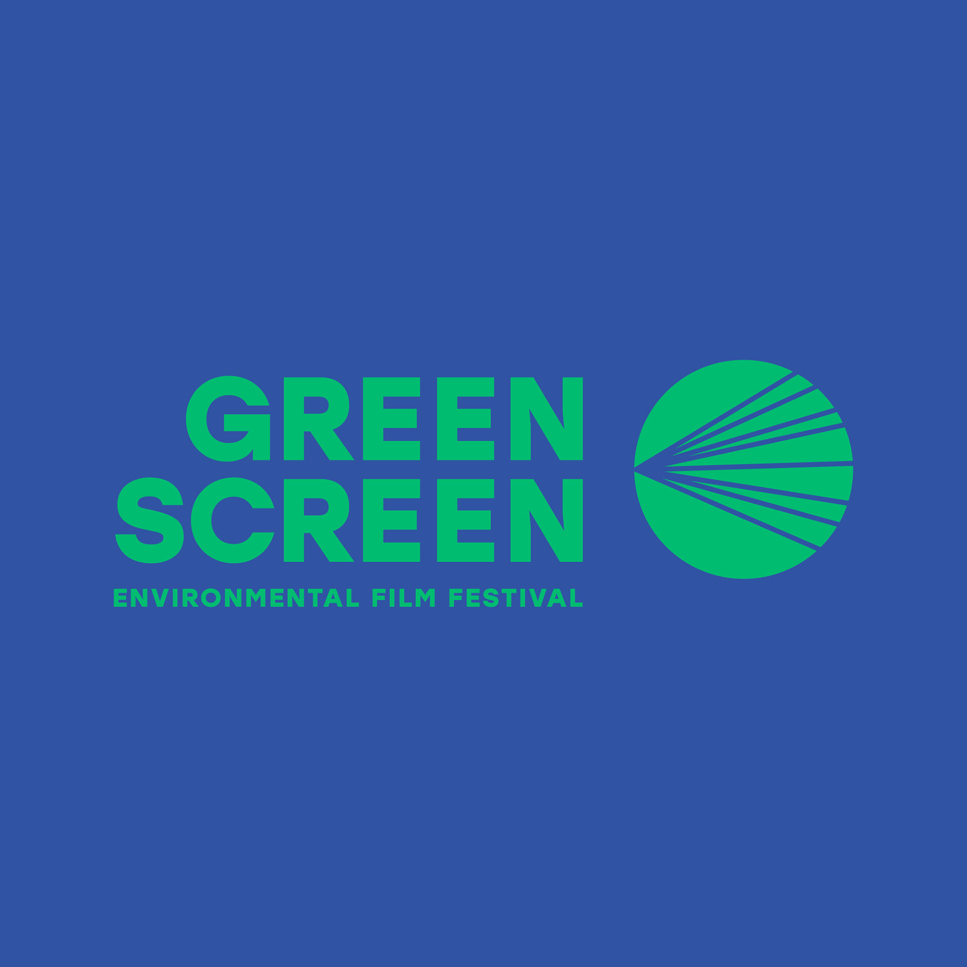
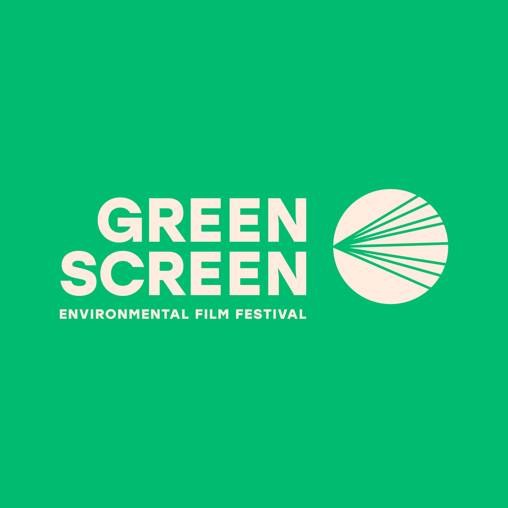
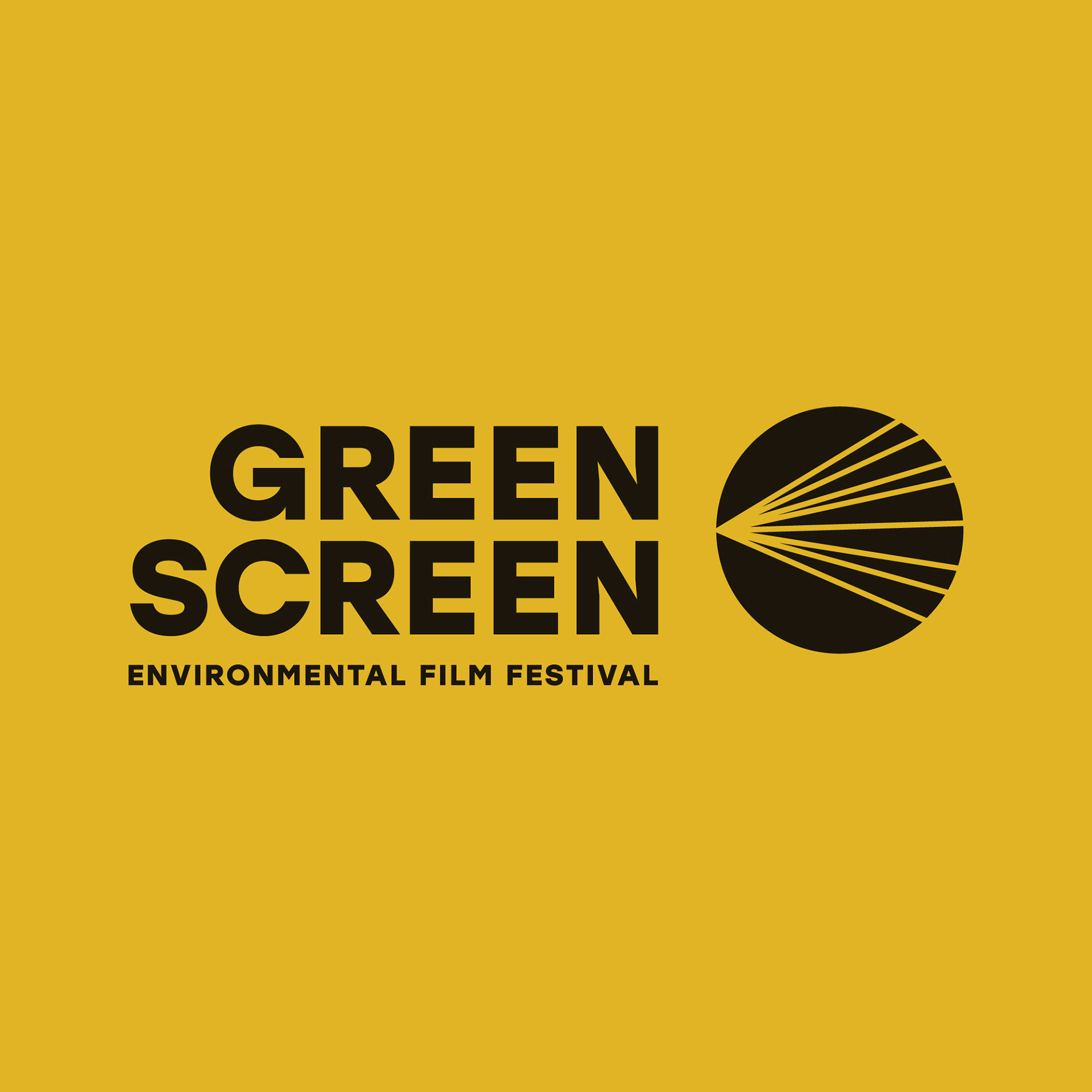
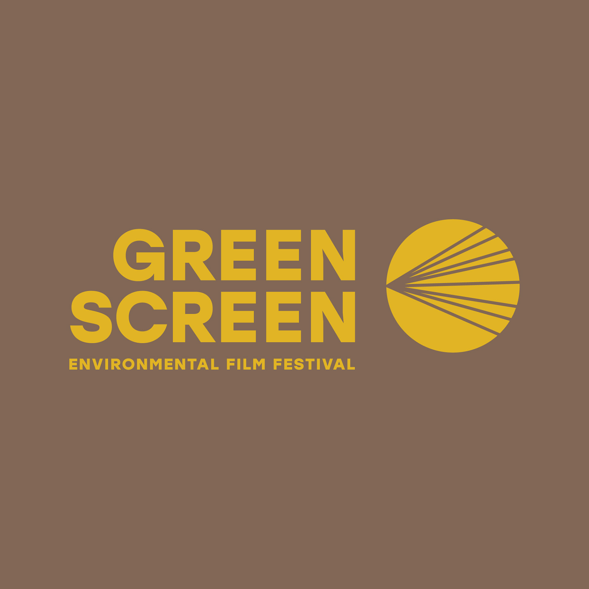
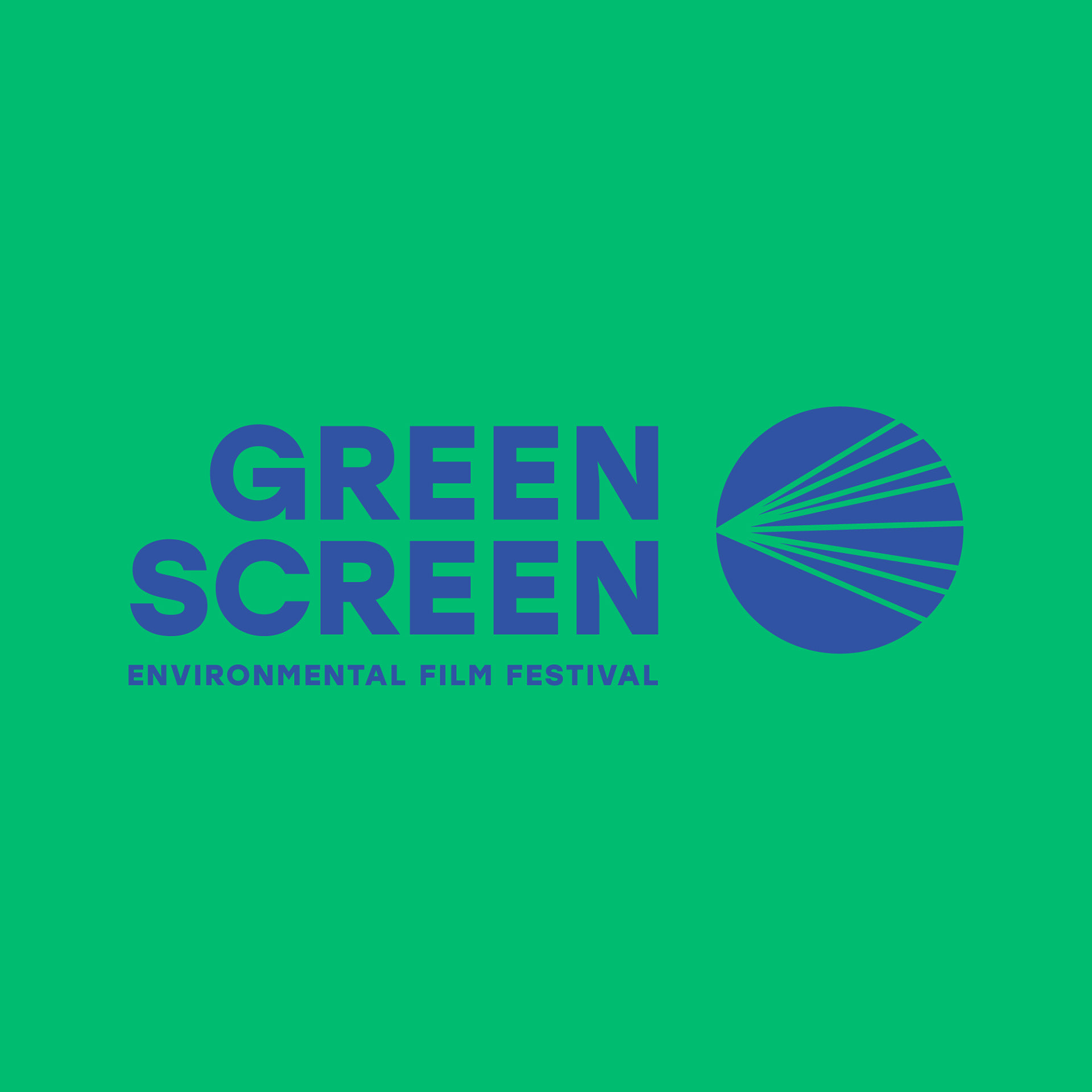
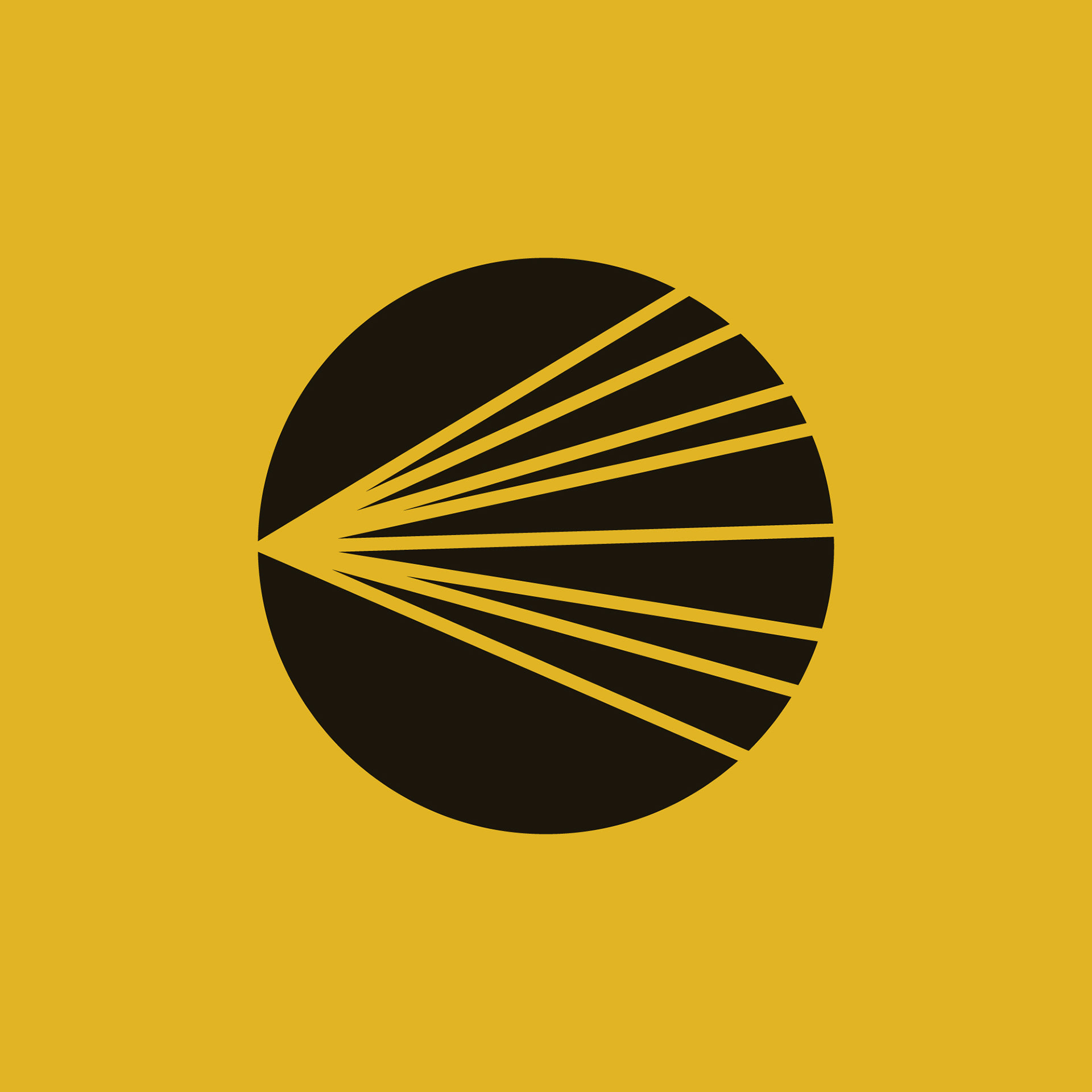
This icon for the Green Screen Environmental Film Festival is intentionally simple.
In its simplicity the viewer is meant to take a closer look to find meaning in it. At the core, the symbol is made up of projection light rays highlighted in a circle. Why a circle instead of a square? The world we live in is round, the circle is a powerful symbol of continuity, unity and as a representation of our planet, it connects people and nature. On another level, lines represent movement, direction, and the angles show a spreading. In this way, the lines represent the dissemination of information. Green Screen uses film, engagement and education to impact communities and create awareness, in the hopes that it leads to changed behaviour, these are the impact lines spreading to the communities we visit. If we’ve seen a science book with a diagram of the eye, it looks pretty similar to this symbol, quite by accident but also what a happy accident that the icon of an environmental film festival is the viewer’s eye absorbing all that Green Screen has to offer.
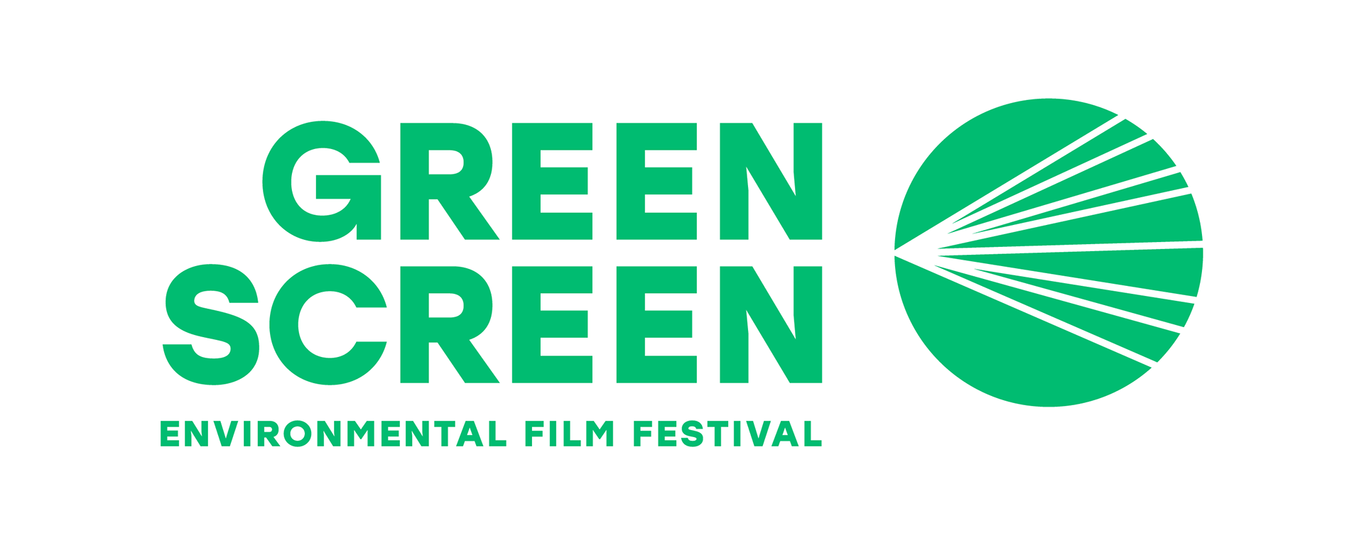
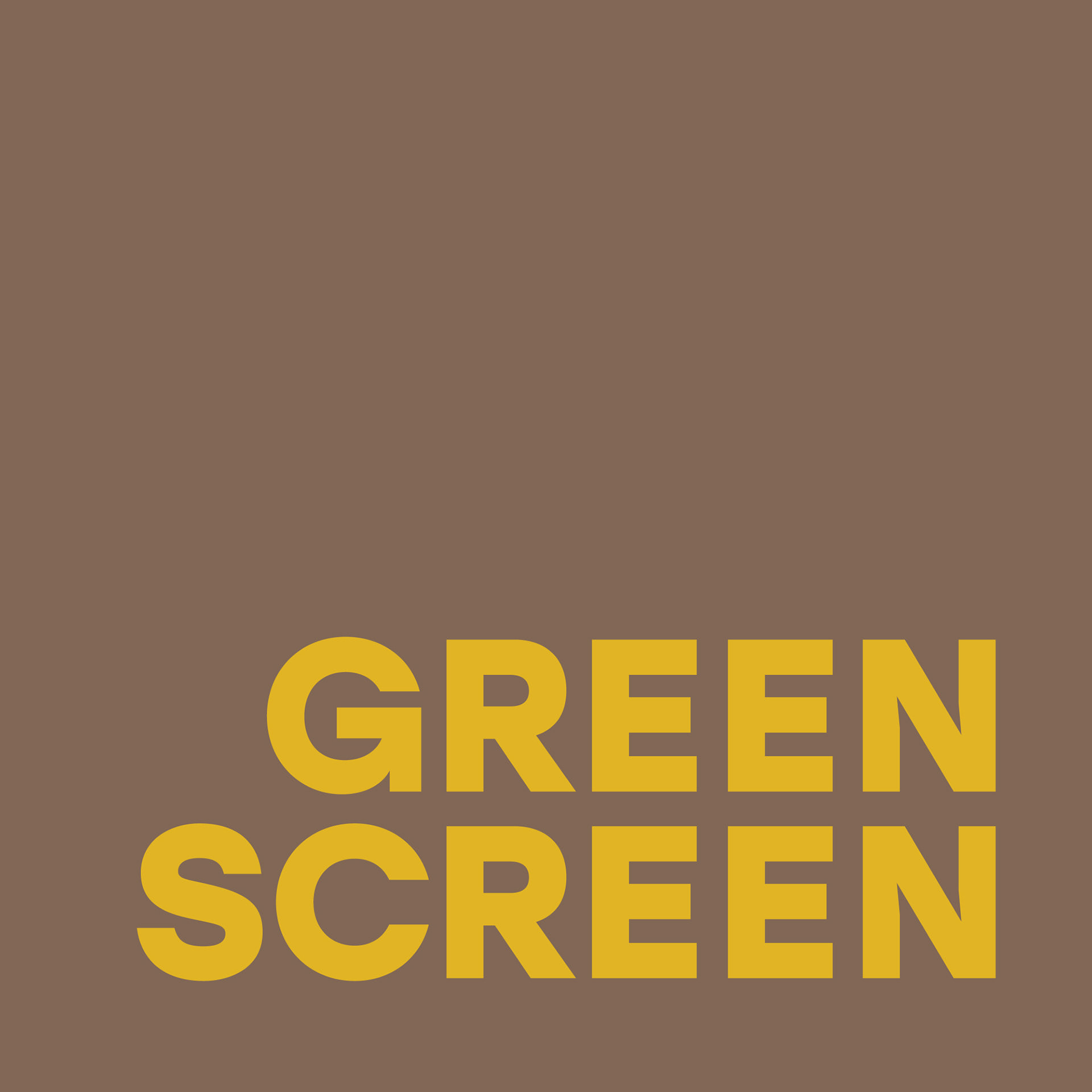
The typography, like the icon, finds its strength in simplicity.
The words GREEN and SCREEN were begging to be right aligned for the repetition of letters to be highlighted. A geometric sans was chosen to balance with the geometry of the icon, for clarity, and honesty, to be simple, bold and effective without any extra fuss. This logo will need to appear on film stills, on screens, on images of multiple subjects, so simple, iconic and geometric seemed the best way to go to contrast with the moving and still imagery it would be paired with. The alignment of the text with the icon also makes the text an object, as it becomes the projector, pushing the light rays onto the circle.
The colour green was chosen for really obvious reasons
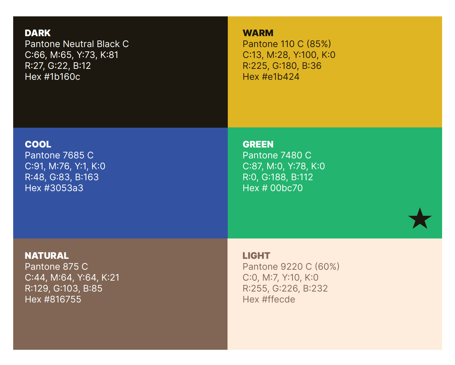
...but the particular shade was inspired by the green screen used in film to place objects and people in any environment, which was the original inspiration for the name of the festival, a play on words if you will. When we think of the environment, there are other colours that come to mind, and some of these colours make up the brand colours for GS. Blue for water, yellow for the sun, warmth, brown for the earth and people, pale cream for the light and black for the darkness needed to project/view film in.
All together these elements come together to represent the festival and a reminder that environmental doesn’t just mean sustainability and climate change but also social justice, gender issues because at the end of the day humans are a large and important part of the earth we live in.