The Client: A pair of cousins with a project/idea they were really passionate about. Only the best kind of clients out there.
The Project: A pop-up restaurant celebrating all things local.
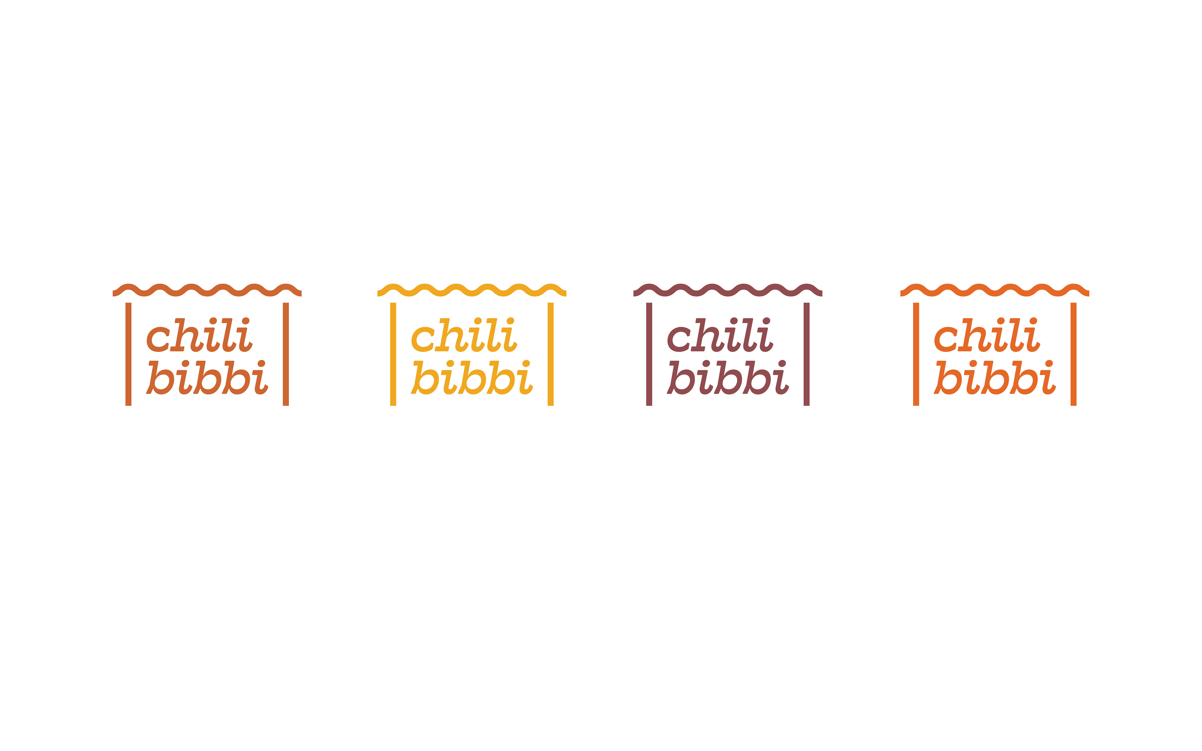
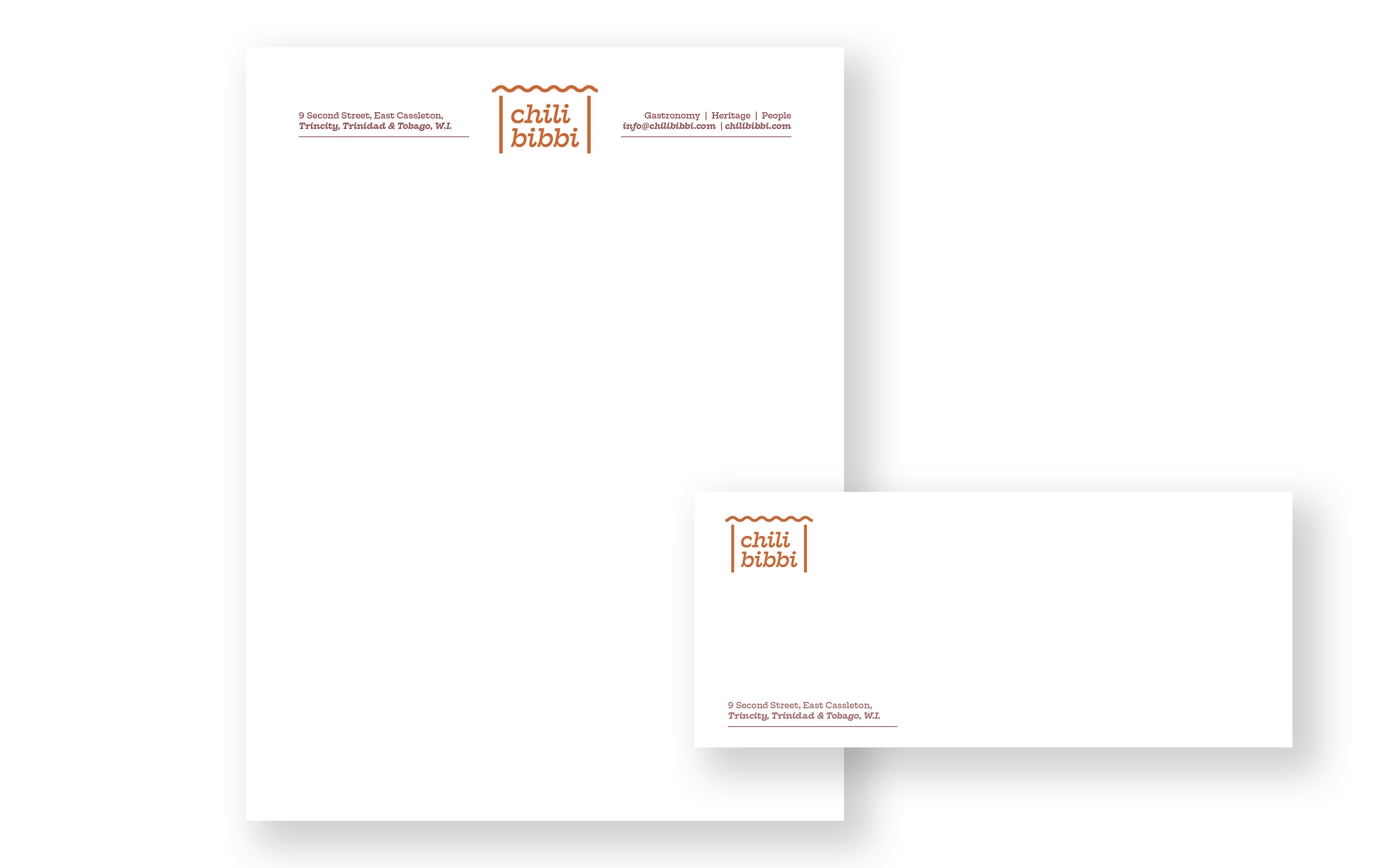
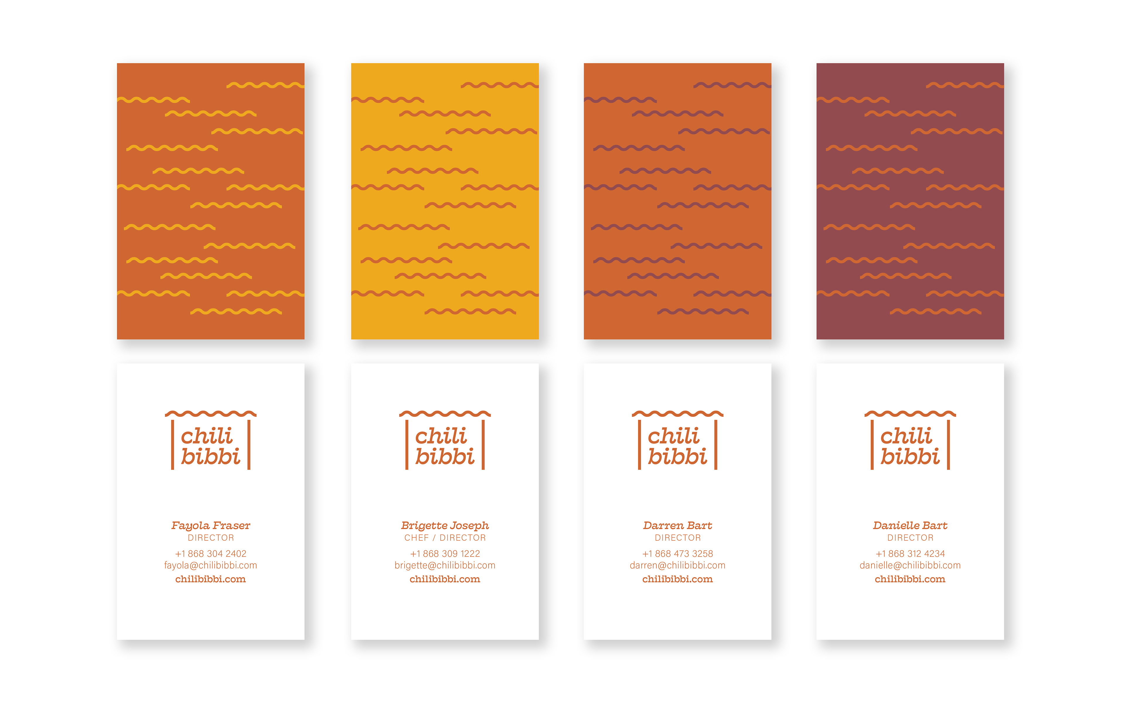
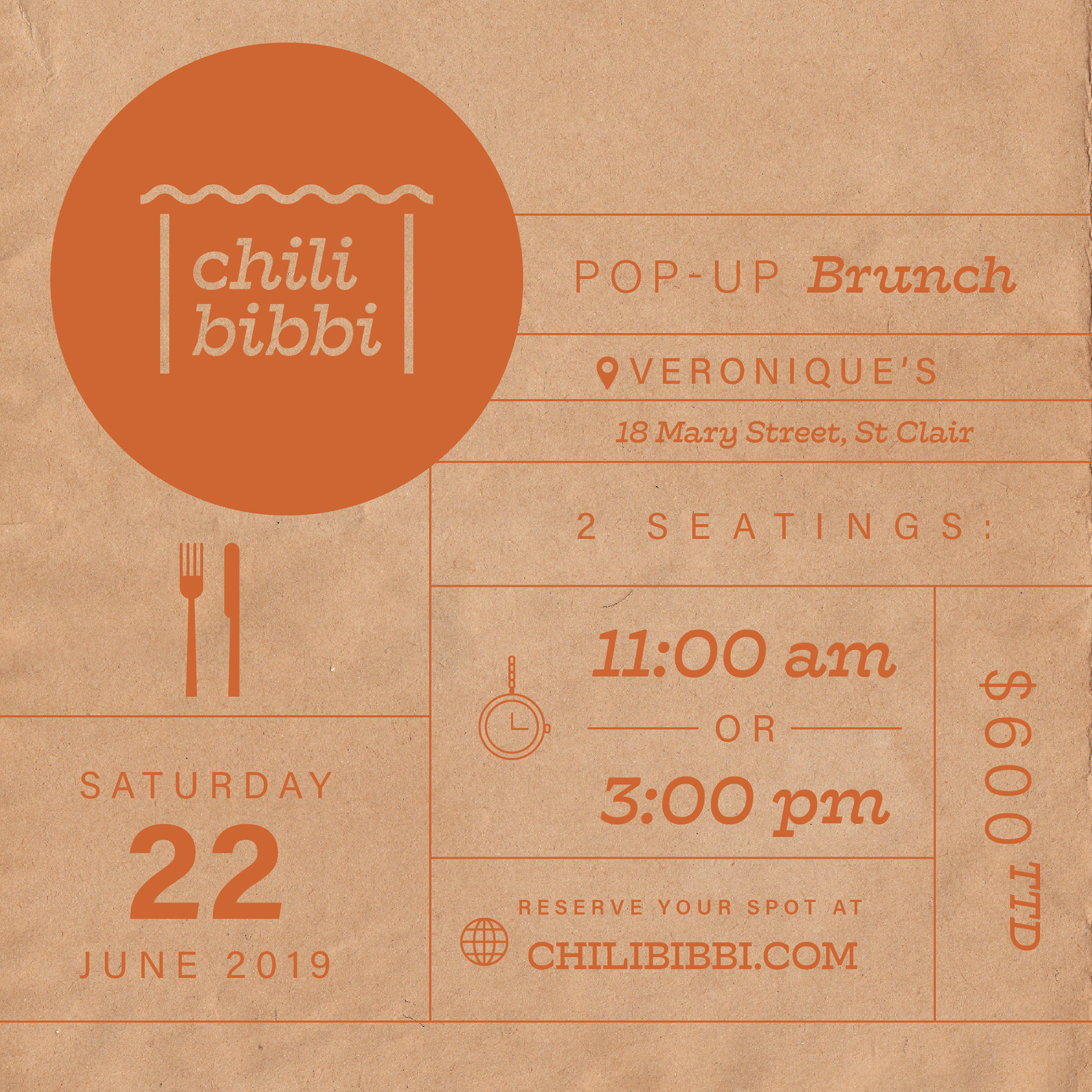
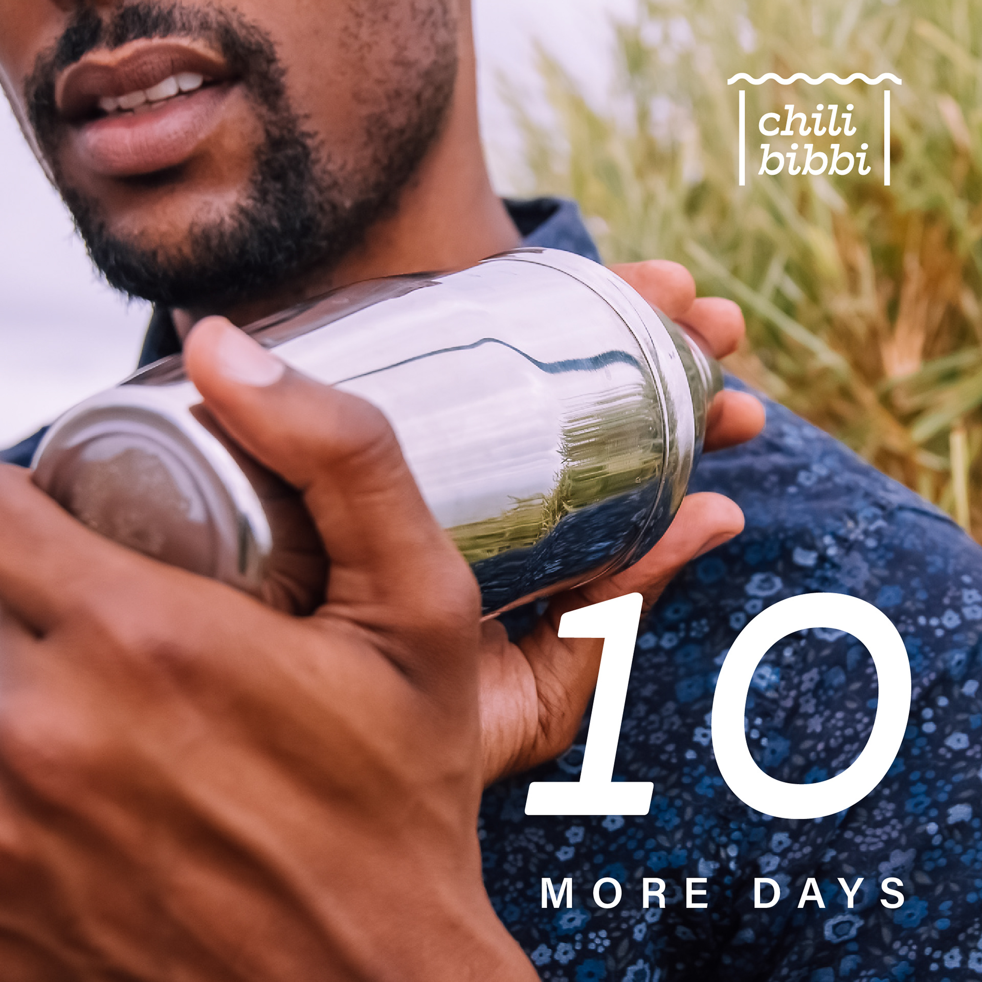
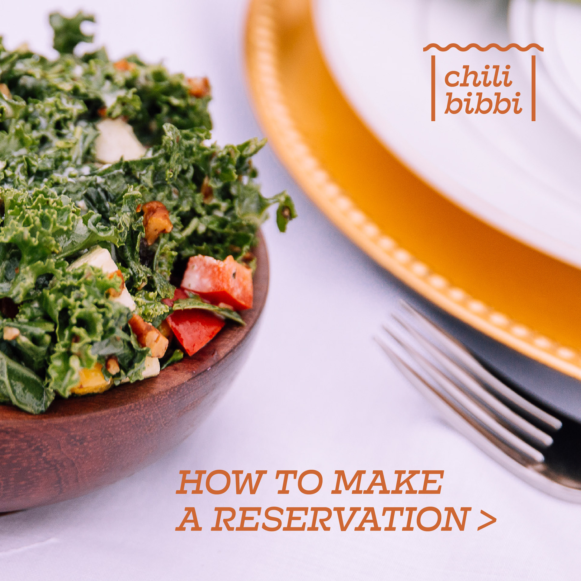
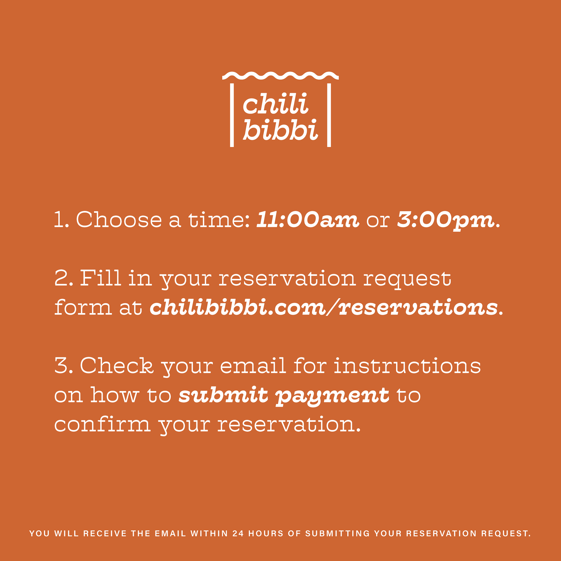
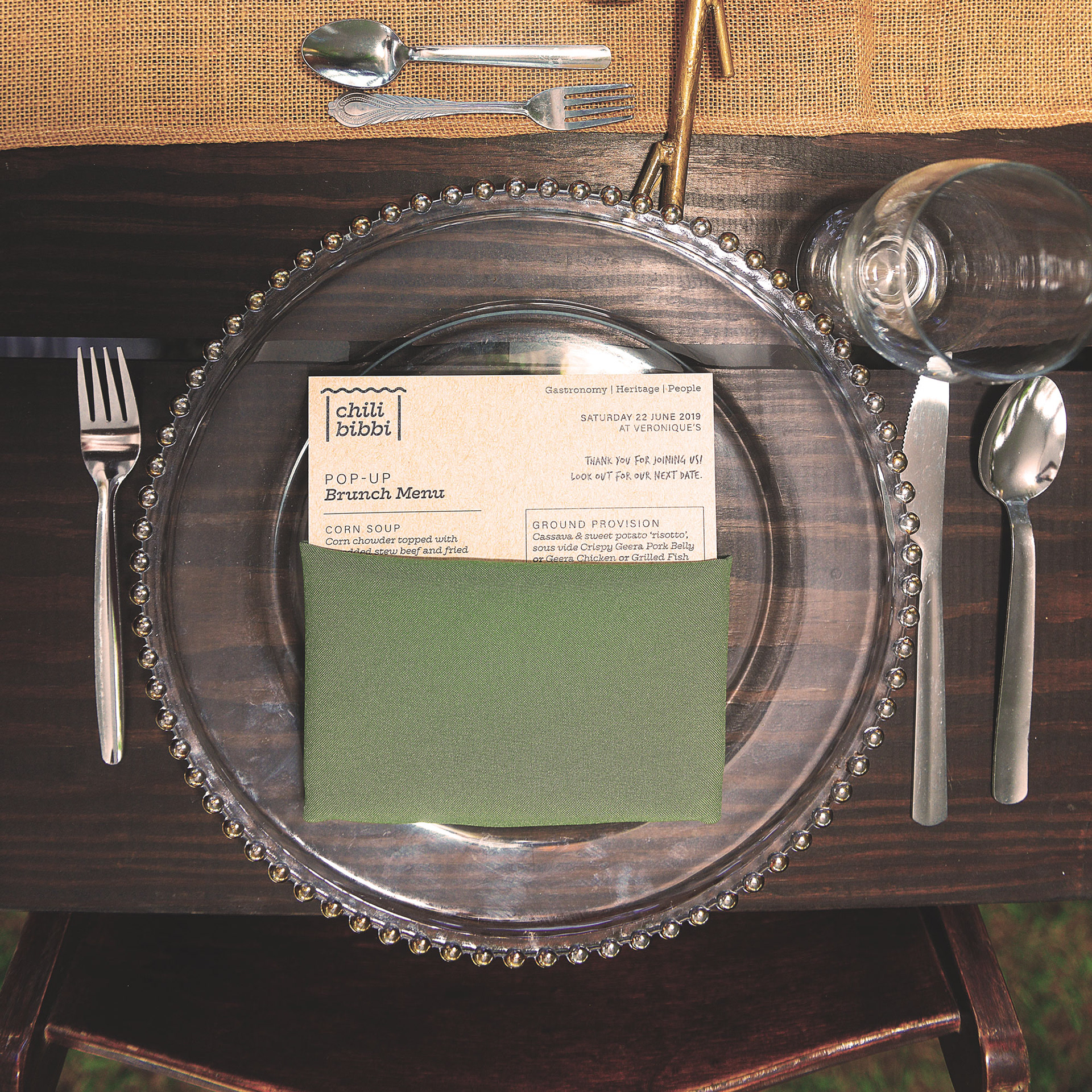
This branding project was fun to work on. Seldom do clients ever pick my "wild card" logo option or my favourite of the options I present, this was one of those seldom times. Inspired by the name and trying not to go too literal with it, I was immediately reminded of my childhood and going to a parlour to buy chilibibbi in a cone made of gazette paper. So my inspiration came from that experience and luckily the client liked it. Below is the brand roll out of the logo, colour palette, stationery and some of the social media items created for the first pop-up event. Photography provided by the client from Voyage Visions and Pernell Roberts.